RankPrompt Review: UX, Performance, Accessibility, and SEO Signals
A practical RankPrompt review covering AI-search positioning, desktop and mobile UX, performance, accessibility, rendering reliability, visual design, and improvement opportunities.
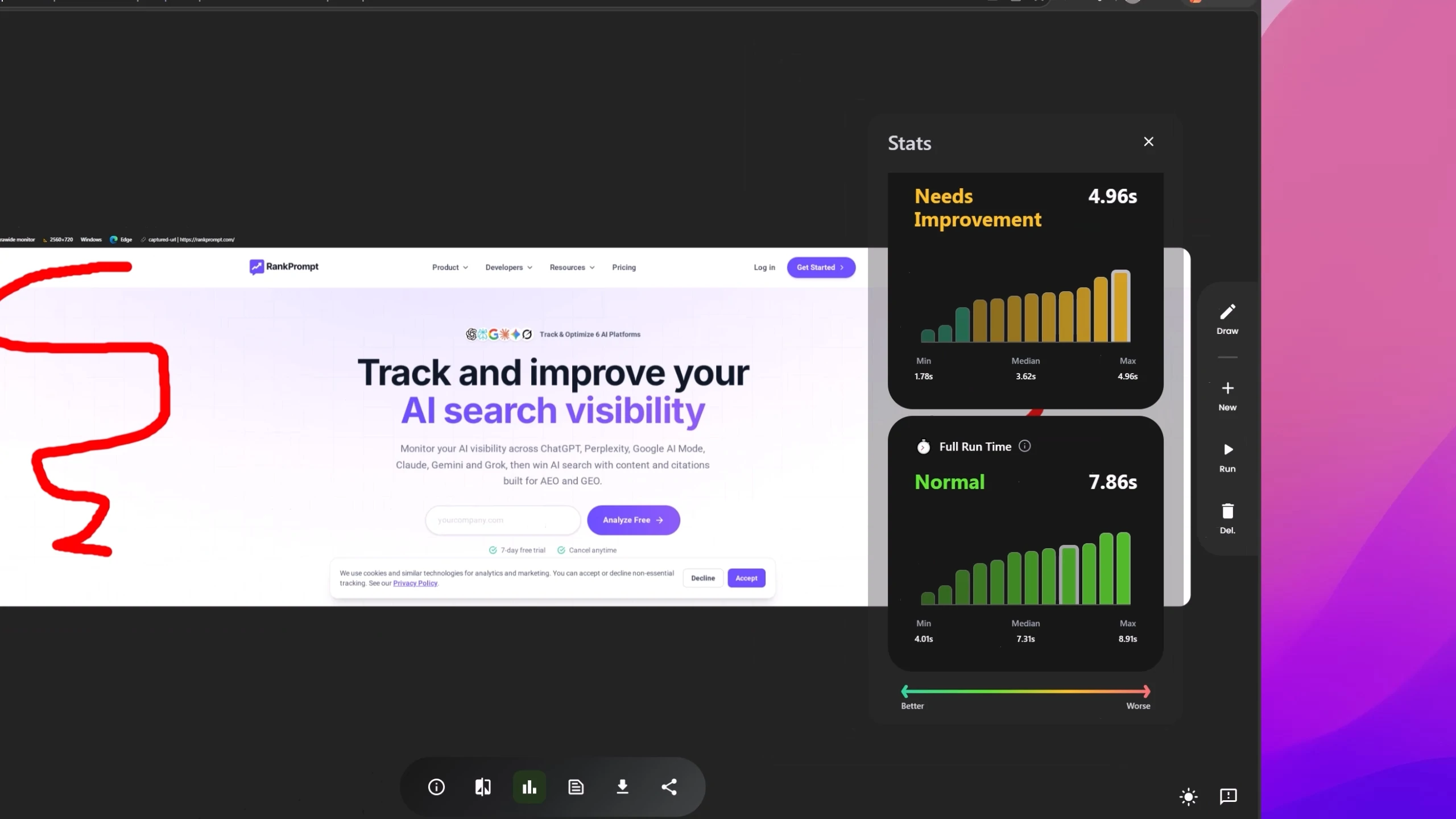
RankPrompt is an AI-search visibility platform for teams that want to understand where their brand appears in answers from tools such as ChatGPT, Perplexity, Gemini, Claude, Grok, and Google AI Mode. The website also positions the product around content optimization, citation analysis, technical SEO, and competitor research.
This review evaluated the landing page across desktop and mobile screen sizes, then checked performance, accessibility, full-page rendering, light-versus-dark behavior, and overall design quality. The strongest signals were clear positioning, solid mobile responsiveness, readable typography, and consistent page structure. The main opportunities are more technical: JavaScript execution time, total page-load time, automated screenshot reliability, widescreen layout balance, skip-link styling, and optional dark-mode support.
🖥️ Desktop Experience
The desktop review covered several screen sizes, including a Dell UltraSharp monitor, Microsoft Surface Pro 11, HP Pavilion 14, and Lenovo ThinkPad view. Across common laptop widths, RankPrompt's layout remained clear and stable. Sections were readable, spacing felt controlled, and the page did not show obvious alignment issues.
The widest monitor exposed the main desktop refinement. The content container looked narrow against the full screen, leaving a large amount of unused space on both sides. The page was still usable, but the composition felt more constrained than it needed to be for a premium desktop display.
The Surface Pro 11 view was more balanced because the content occupied a more natural portion of the viewport. The HP Pavilion 14 and Lenovo ThinkPad views produced similarly positive results, which suggests the current layout works best around normal laptop and medium desktop widths.
RankPrompt does not need to remove generous margins entirely. A better adjustment would be to increase the maximum width of selected sections, especially areas that contain feature cards, comparison content, product visuals, or proof points. Letting key sections breathe on wider screens would make the page feel more intentional without sacrificing readability.
📱 Mobile Experience
The mobile review was largely positive. The first mobile view showed some slight compression, but the page remained functional. The Google Pixel 8 and Samsung Galaxy views looked stronger, with readable content, appropriate spacing, and no major horizontal-overflow issues observed.
This is an important strength for a SaaS landing page. Navigation, hero content, call-to-action groups, and dense feature sections often become harder to scan on smaller screens. In the tested mobile views, RankPrompt preserved the primary content hierarchy and kept the page usable.
The mobile work should focus on refinement rather than repair. Narrow-width spacing, button groups, and any dense sections should be checked for visual compression, especially on devices smaller than the reviewed Pixel and Galaxy widths.
⚡ Performance Review
The performance recording showed healthy early loading signals. Time to First Byte looked good, DOM Content Loaded performed well, and initial rendering metrics appeared healthy. On mobile, First Contentful Paint also stayed within a good range in the tested views.
The concern is what happens after those early milestones. JavaScript execution time stood out on desktop, with some median results higher than expected. Page-load time also appeared elevated in several tested views. This does not mean visitors necessarily stare at a blank page; the main content may appear much earlier. Still, a long loading tail can affect perceived polish, conversion tracking, automated testing, and crawler-like rendering.
Mobile performance followed a similar pattern. Most JavaScript results were acceptable, but a few of the twelve tested mobile views were slower, and total page-load time remained the recurring concern.
Because the pattern appeared across multiple views, RankPrompt should audit the work performed during initial load. Good next steps include reviewing bundle size, deferring nonessential JavaScript, checking third-party analytics and tracking scripts, lazy-loading below-the-fold interactive elements, and confirming that animation or visual-effect libraries are not doing unnecessary work before the page is usable.
♿ Accessibility Review
The accessibility recording focused on keyboard navigation in a mobile viewport. The tab order generally looked reasonable, and most interactive elements could be reached correctly. That is a useful baseline because keyboard access supports users who cannot or prefer not to use a mouse, and it often reflects the quality of the underlying interactive markup.
The main accessibility note involved the "Skip to main content" link. A skip link should let keyboard and screen-reader users bypass repeated navigation and jump directly to the main page content. The recording showed it becoming visible when focused, which is usually correct. The part to verify is whether it stays visually hidden before focus, appears clearly only while focused, and sends focus to the intended main content target.
Beyond that item, the reviewed focus sequence did not show a major keyboard-navigation problem. RankPrompt should still run a broader accessibility pass for color contrast, semantic heading order, visible focus states, button names, form labels, and any interactive product previews or menus.
🌗 Dark Mode and Visual Adaptability
The light-versus-dark comparison showed nearly identical visuals when the device requested light mode and dark mode. This indicates that RankPrompt currently presents a consistent light theme rather than a dedicated color scheme for system dark-mode preference.
That is not automatically a flaw. A fixed light theme can work well when contrast is strong and the brand depends on a specific visual system. For an AI and software product, though, optional dark-mode support could improve comfort for users browsing in low-light environments and make the experience feel more aligned with modern device preferences.
🧪 Rendering, Screenshots, and Technical Signals
The full-page screenshot test revealed a large empty area between the beginning of the page and the footer. Since the footer still rendered, the page itself appeared to remain present, but some intermediate content may not have been captured or displayed correctly in the automated screenshot environment.
This may indicate lazy loading, scroll-triggered animations, viewport detection, client-side rendering, or hydration behavior that depends on conditions not present during full-page capture. The issue matters because important content should render reliably for QA tools, visual-regression testing, screenshot services, and crawler-like environments.
RankPrompt should test the page under the same conditions used by automated capture tools. Sections that contain core marketing content should be present in the DOM and should not depend on fragile scroll or visibility triggers before they become available.
The browser logs were mostly reassuring. Navigation completed successfully, and no major application errors were visible in the console. A few analytics-related requests appeared to fail, but that can happen in automated testing contexts. Production analytics should still be monitored so tracking issues do not go unnoticed.
🎨 Visual Design and Brand Perception
RankPrompt presents as a polished modern SaaS product. The typography is readable, the sections are organized, and the page communicates its AI-search visibility category without burying visitors in technical detail.
The review also noted familiar AI-product styling: bright gradient accents, glow effects, card-based sections, and prominent call-to-action buttons. These choices help visitors quickly understand the category, but they can also make the brand feel closer to other AI landing pages than the product may deserve.
The opportunity is differentiation. RankPrompt could keep its current polish while adding more ownable product visuals, clearer examples of AI-search visibility reports, stronger data visualizations, distinctive iconography, and more deliberate use of brand color. That would help the page feel less template-like and more specific to RankPrompt's value.
🛠️ Recommended Improvements
-
Optimize JavaScript and total page-load time. Audit bundle size, hydration cost, analytics tags, third-party scripts, and animation libraries. Defer nonessential work so the page becomes usable with less client-side processing.
-
Investigate the full-page screenshot gap. Review lazy-loaded, animated, and scroll-triggered sections in automated capture tools. Core content should render reliably without depending on fragile viewport behavior.
-
Improve widescreen balance. Increase the max-width of selected desktop sections so wide monitors feel intentionally designed rather than overly constrained.
-
Verify skip-link behavior. Keep the skip link visually hidden by default, reveal it clearly on focus, and confirm that it targets the main content correctly.
-
Refine narrow mobile spacing. Check compressed areas around navigation, hero content, button groups, and dense feature sections.
-
Consider optional dark-mode support. A dedicated dark theme is not required, but it could improve comfort and perceived maturity for software-focused audiences.
-
Strengthen visual distinctiveness. Use more product-specific imagery, data examples, and brand-owned visual details to stand apart from common AI/SaaS conventions.
🎯 Final Verdict
RankPrompt's landing page is clear, responsive, and professional. It explains a timely product category well, holds together across common laptop and mobile views, and gives visitors a credible first impression.
The next improvements are mostly about execution quality: reduce JavaScript work, shorten the full loading process, make automated rendering more reliable, improve widescreen composition, confirm skip-link styling, and consider dark-mode support. With those changes, RankPrompt could feel faster, more resilient, and more distinctive while reinforcing user trust and brand credibility.