Simple Analytics Review: Privacy-First UX, Performance, and Accessibility Signals
A practical Simple Analytics review covering privacy-first positioning, desktop and mobile UX, performance, accessibility, dark mode, responsive breakpoints, and improvement opportunities.
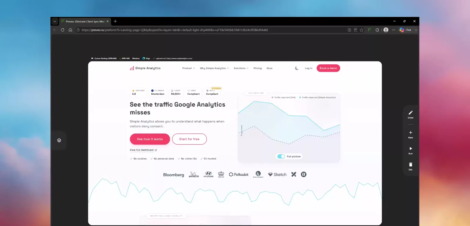
Simple Analytics is a privacy-first alternative to Google Analytics, built to measure website traffic without cookies, personal data, or visitor identification. The company positions itself around a specific claim: that consent-based tools like Google Analytics undercount traffic once visitors decline tracking, and that a cookieless approach can recover that missing 20-60% of the picture. The Amsterdam-based product reports GDPR, CCPA, and PECR compliance out of the box, EU-hosted infrastructure, a 4.8 Capterra rating, and more than 39,500 users.
This review evaluated the marketing landing page across desktop and mobile screen sizes, then checked performance, keyboard accessibility, light-versus-dark behavior, continuous responsive reflow, and overall visual design. The strongest signals were a genuinely working dark mode, reliable mobile responsiveness, and a distinctive privacy-first visual story. The main opportunities are more technical: an inconsistent Largest Contentful Paint on desktop, a data-visualization panel that gets clipped on very wide monitors, and a keyboard tab order that skips two primary navigation items.
🖥️ Desktop Experience
The desktop review covered a 2025 Lenovo ThinkPad, a wider desktop viewport, and a Dell UltraSharp monitor. On the ThinkPad view, the landing page looked polished and well organized: sections followed a clear visual order, spacing felt balanced, and no obvious alignment or responsiveness problems appeared as the page was scrolled through in full.
The wider desktop viewport held up well too, with most sections scaling cleanly and the overall structure staying stable. On the Dell UltraSharp view, however, the review found a specific issue: the "data gap" diagram that visualizes traffic reported by Google Analytics against traffic observed by Simple Analytics appeared constrained and partly cut off. That diagram is one of the page's main persuasive devices, so giving it a wider container at large breakpoints would let it do its job more completely. The review also noted a large amount of unused space on both sides of the page at very wide resolutions, suggesting the current maximum content width could be increased for large desktop monitors.
📱 Mobile Experience
On the iPhone 15, the page adapted well: navigation, typography, content blocks, and the data-gap illustration all fit comfortably within the narrower viewport with no major horizontal overflow. The animated diagram remained active on mobile, though the review questioned whether the motion adds enough value on a small screen to justify the extra visual activity and potential performance cost.
On the iPhone 11 Pro, the row of customer and partner logos wrapped into three lines instead of the tighter two-row arrangement seen on larger phones, producing a taller and slightly less balanced section. This is a minor refinement rather than a functional problem: adjusting logo size, spacing, or the number of items shown per row would tighten it up. Beyond that, the remaining content stacked correctly, and the mobile layout read as a genuine mobile design rather than a compressed desktop page.
⚡ Performance Review
View: iPhone 15 Pro Max mobile performance
Desktop performance opened strong: Time to First Byte came in at a Good 56ms, DOM Content Loaded landed at a Good 645ms, and First Contentful Paint was Good, with a median around 1.41s. Cumulative Layout Shift was excellent at 0.001, meaning the page doesn't jump around as it loads.
Largest Contentful Paint is where desktop results become inconsistent. While the median tracked with FCP at roughly 1.41s, one tested run recorded a Poor 12.69s, with a max around 12.89s. The review attributes this to the animated "data gap" diagram in the hero: because its visible content keeps changing while the page loads, the browser can end up waiting on that element to settle before it counts as the largest contentful paint, dragging out worst-case results. Total page-load time followed a similar pattern — the load event itself was Good at a median of 2.59s, but the overall page-load time needs attention, since it appeared elevated in several tested runs.
Mobile performance was more consistent. On an iPhone 15 Pro Max, First Contentful Paint and Largest Contentful Paint both landed in the Good range around 500ms, JavaScript execution stayed largely under a second, and the load event completed in a Good 609ms. The review also checked for console errors, failed network requests, and broken resources across the tested mobile devices, and found no major failures.
A practical next step would be to load a static version of the data-gap diagram first and let the interactive/animated version take over only after the above-the-fold content has rendered. That should reduce the diagram's effect on perceived loading speed and tighten the worst-case desktop LCP results.
♿ Accessibility Review
Compare: desktop vs mobile keyboard order
On desktop, pressing Tab moved focus through interactive elements in a generally reasonable order, letting a keyboard user reach most of the page without a mouse. The notable exception was the main navigation: the keyboard order appeared to skip the "Product" and "Why Simple Analytics" menu items, jumping directly to later links such as Solutions, Pricing, or Docs.
Those two menu items may be implemented as dropdown triggers or non-link controls rather than standard focusable links, which would explain why they're bypassed in sequential tab order. Regardless of the underlying cause, every meaningful navigation option should be reachable and understandable through the keyboard. On mobile, the focus order initially appeared limited to the first available control before normalizing as the test continued; the mobile menu should be checked separately to confirm every item is consistently reachable, and a clearly visible focus indicator should be present throughout.
🌗 Dark Mode and Visual Adaptability
Unlike a fixed-theme marketing site, Simple Analytics ships a real dark mode. The light theme uses the brand's warm beige background, while the dark theme shifts to a deeper, higher-contrast presentation. Both versions preserved the design well: text stayed readable, illustrations remained integrated with the page, and the pink accent color continued to stand out in both modes.
No major contrast, consistency, or component-styling problems appeared between the two themes in the tested views. For a privacy-focused product whose audience skews technical, a working dark mode is a meaningful, low-friction point in Simple Analytics' favor.
📐 Responsive Breakpoint Behavior
View: continuous shrink/expand test
Beyond fixed device sizes, the review ran a continuous shrink-and-expand test, gradually resizing the viewport down from a 1280×800 baseline to roughly 20% of that size and back. Sections reflowed smoothly throughout: content moved from wider arrangements into narrower stacked layouts without overlap, sudden horizontal scrolling, or broken positioning.
This kind of continuous test is a stronger signal than checking a handful of standard device widths, since layout bugs often appear only at specific in-between breakpoints. Simple Analytics' layout held up predictably even through the most extreme part of the transition.
🎨 Visual Design and Brand Perception
View: AI-assembled pattern check
Viewed critically for generic, AI-assembled SaaS patterns, the Simple Analytics landing page doesn't read as template-like. It has a clear visual identity and a focused argument built around one idea: the gap between traffic Google Analytics reports and traffic Simple Analytics observes. The data-gap diagram is the centerpiece of that argument, turning an abstract privacy claim into a concrete visual comparison. Headings are direct, supporting copy is easy to scan, and calls to action sit where visitors would expect them.
The review flagged two smaller refinements: the primary action buttons could be differentiated more strongly from secondary buttons in a few sections, and the animated hero diagram — the same element implicated in the desktop LCP variance — could be optimized so its visual appeal doesn't come at the cost of loading performance.
🛠️ Recommended Improvements
View: full-screen ultra-wide capture
- Stabilize the desktop Largest Contentful Paint. Render a static version of the data-gap diagram first and defer the animated version until after above-the-fold content has painted, addressing the observed worst-case result of nearly 13 seconds.
- Give the data-gap diagram more room on very wide monitors. The Dell UltraSharp view showed the illustration constrained or clipped; a wider container at large breakpoints would let it render fully.
- Increase maximum content width or improve spacing on ultra-wide desktops. The current layout leaves a large amount of unused space on both sides of the page at very wide resolutions.
- Make the "Product" and "Why Simple Analytics" navigation items keyboard-reachable in tab order. Confirm whether they're implemented as non-link controls, and ensure a visible focus indicator is present throughout.
- Verify the mobile menu's focus order. Confirm every item is consistently reachable once a user starts tabbing through the mobile navigation.
- Tighten the mobile partner-logo row. Adjust logo size or spacing so it doesn't wrap into three lines on smaller phones like the iPhone 11 Pro.
- Reconsider the hero animation on mobile. A lighter or static mobile version could reduce visual noise and performance cost without losing communicative value.
🎯 Final Verdict
Simple Analytics presents a clear, privacy-focused landing page that holds up well across desktop and mobile devices, supports a genuine dark mode, and survives a continuous responsive stress test without breaking. Its central pitch — showing the traffic gap that cookie-consent tools miss — comes through clearly in both the copy and the visuals.
The improvements that would move this from solid to excellent are concentrated in two places: the animated data-gap diagram, which appears responsible for both the ultra-wide clipping issue and the desktop LCP variance, and keyboard accessibility, where two primary navigation items currently fall outside the tab order. Neither issue reflects a broken experience; both are specific, fixable refinements on top of an already credible product page.