AI coding
Your AI Coding Agent Built the Page. How Does It Know the Page Works?
A practical way to review AI-built websites using browser captures, focused checks, and a second look after the fix.

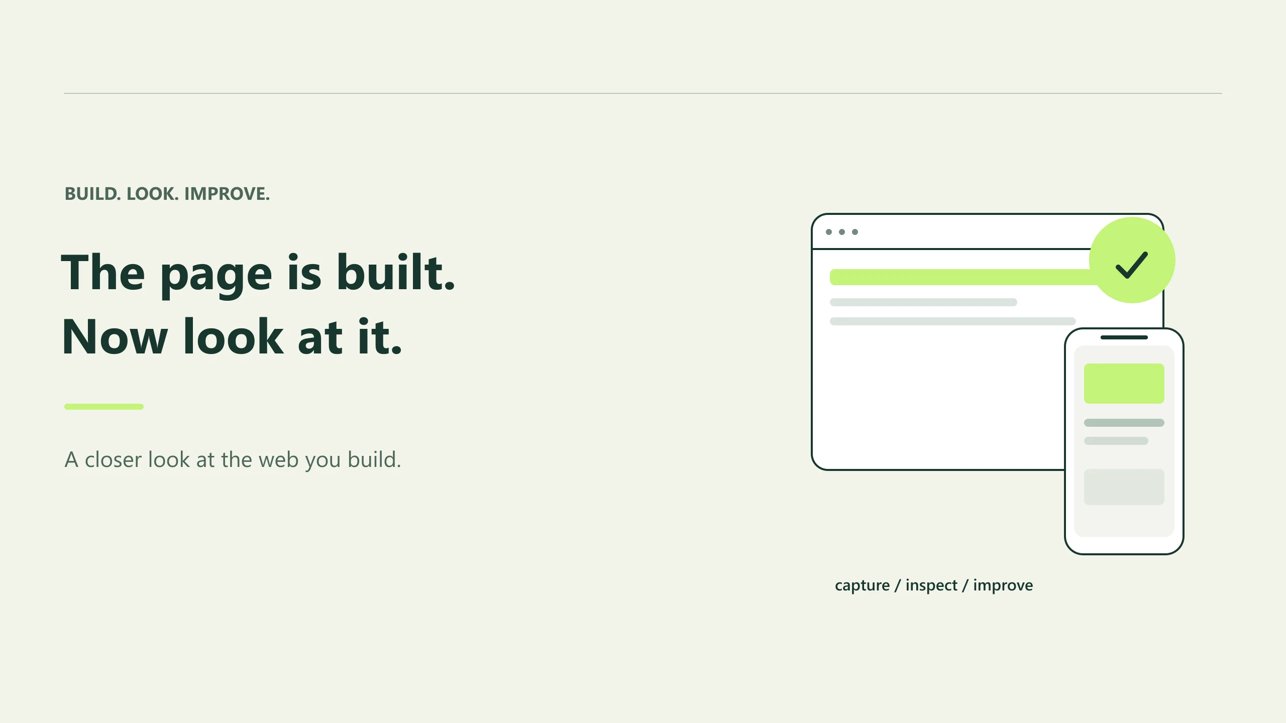
The page compiles. The components are in place. Your agent gives you a tidy explanation of what it changed.
Then you open the pricing page on your phone, and the last card sticks out past the edge of the screen.
It's a small problem with an awkward implication: the work was finished before anyone had seen the result at that width.
AI coding tools make it easy to move from an idea to a working implementation. That makes the moment after implementation more important. Someone still has to open the page, look at what happened, and decide whether the change did its job.
That someone can include the agent, provided you give it a way to inspect the website it built.
Start with the page, then follow the evidence
Imagine you've asked an agent to redesign a pricing section. It creates three cards, adds a billing toggle, and makes the recommended plan more prominent.
A useful review begins with a concrete question:
Check the pricing page on desktop and mobile. Look for horizontal overflow, cramped plan details, and anything that makes the primary action hard to find. Show me the captures behind your findings.
That request gives the review a boundary. There's a route, a set of conditions, and a reason to look at the result.
With Preveo connected through MCP, the agent can discover the available Use Cases, configure captures, run them, and retrieve the saved evidence. The review lives in an ordinary Preveo thread under your project, so you can open it yourself.
For a first pass, captures may be enough. A macro is an optional addition for a particular kind of evaluation, selected when you request one or your saved project instructions call for it.
The distinction helps keep the work deliberate. You can ask for a straightforward responsive review without turning it into an open-ended assessment of everything on the site.
A finding should give you something to check
"The mobile experience needs improvement" doesn't help much when you're trying to ship.
Consider this illustrative finding instead:
On the narrow mobile capture, the annual billing label extends beyond its container and is partially hidden. The monthly label fits. Check the toggle's fixed width and the space reserved for the longer label.
There's enough detail here to investigate. You know which capture matters, what to look for, and where to begin in the code.
The proposed cause still needs checking. Maybe the fixed width is responsible. Maybe the intended font failed to load. Maybe the page is displaying an unusually long translation.
The capture establishes the visible problem. Inspection of the implementation helps explain it. Keeping those two steps separate makes it easier to catch a plausible explanation that happens to be wrong.
Make the fix small enough to understand
Once the agent has evidence, it can make a focused change: allow a label to wrap, adjust the card layout, or remove a minimum width that forces overflow.
Then ask it to capture the same page again under the same conditions.
This is where a review earns its place in the workflow. You can see whether the original problem disappeared and whether the fix disturbed a neighboring element. A wider billing toggle might solve the label problem while squeezing the heading beside it.
Keep the route, viewport, content, and page state consistent where possible. Save a separate copy of any baseline you need to preserve, since rerunning cloud layers can replace their captures.
The before and after should answer a specific question: did this change resolve the issue we actually observed?
Let the agent handle the repeatable work
There's plenty of useful work around that question. The agent can organize the review under the right project, choose supported devices, wait for the capture job, retrieve the evidence, and connect a finding to the relevant component.
You can also save project and folder instructions for checks you regularly need. A team working on a multilingual checkout might keep its review expectations with that area of the project, rather than explaining them in every conversation.
Some decisions will still need your judgment. Whether the emphasis feels right. Whether a shorter label loses an important promise. Whether the design represents your business the way you intended.
Those decisions become easier when the discussion points to the same page and the same evidence.
Give the next task a visible finish line
Try adding one sentence to your next UI request:
After implementing this, capture the affected page at the relevant desktop and mobile sizes, inspect the result, and tell me what still needs attention.
If you're using Preveo, its MCP setup guide is the starting point for connecting your agent.
A successful review might uncover a bug. It might also show that the change behaves as intended within the conditions you checked. Both are useful outcomes.
The important part is that the final explanation has a page behind it that you can open and judge for yourself.
 Install Browser Extension