- Responsiveness
Test Website for Mobile Friendly
Evaluates mobile friendliness by analyzing viewport settings, horizontal overflow, small touch targets, small text, and responsive layout issues.
Evaluates mobile friendliness by analyzing viewport settings, horizontal overflow, small touch targets, small text, and responsive layout issues.
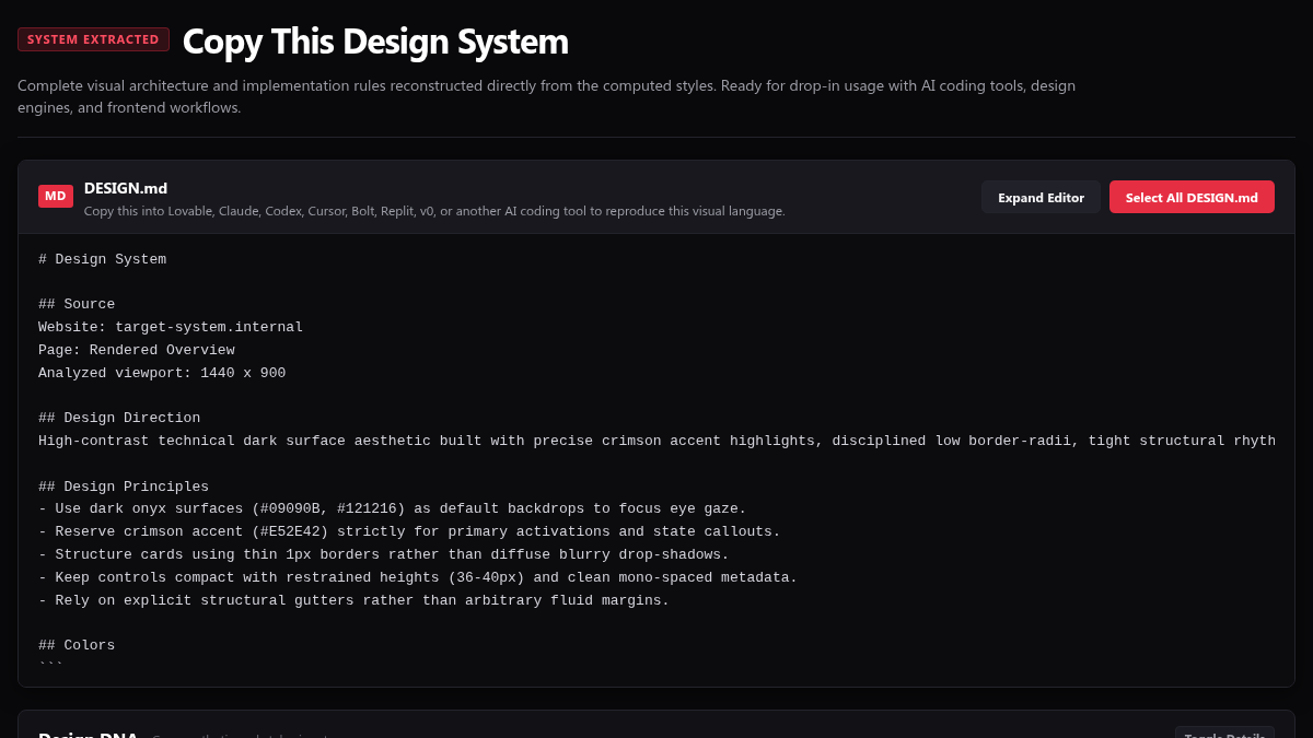
Analyzes the current page to extract and reconstruct its visual design system, including typography scales, color palettes, spacing grids, layout rules, component styles, and motion tokens.
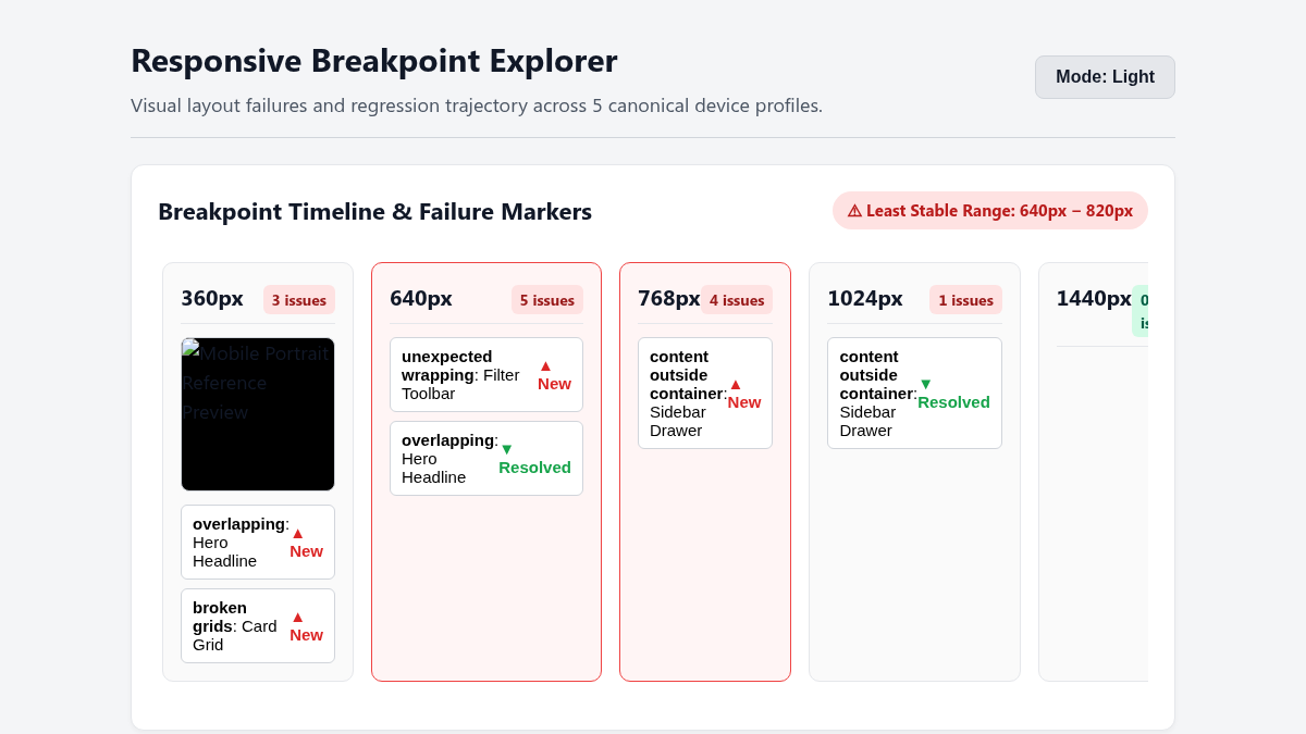
Analyzes the layout for responsive design issues including container overflows, horizontal viewport spilling, text clipping, and overlapping elements at the current viewport width.
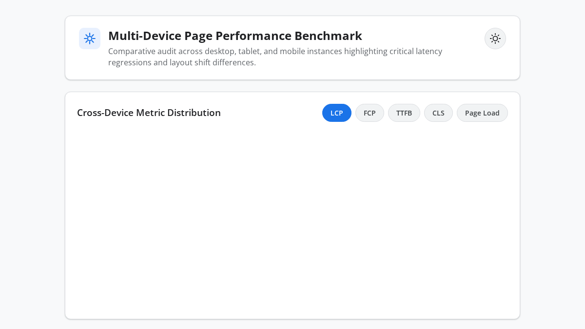
Reports and compares key performance metrics—including Largest Contentful Paint, First Contentful Paint, Time to First Byte, Cumulative Layout Shift, and Total Page Load Time—to evaluate page speed and identify potential performance bottlenecks.


