website design
You Asked AI for a Unique Website. So Why Does It Look Like Everyone Else’s?
Move beyond vague design prompts. Use a reference website, Preveo, and DESIGN.md to give your AI builder a clearer visual direction.

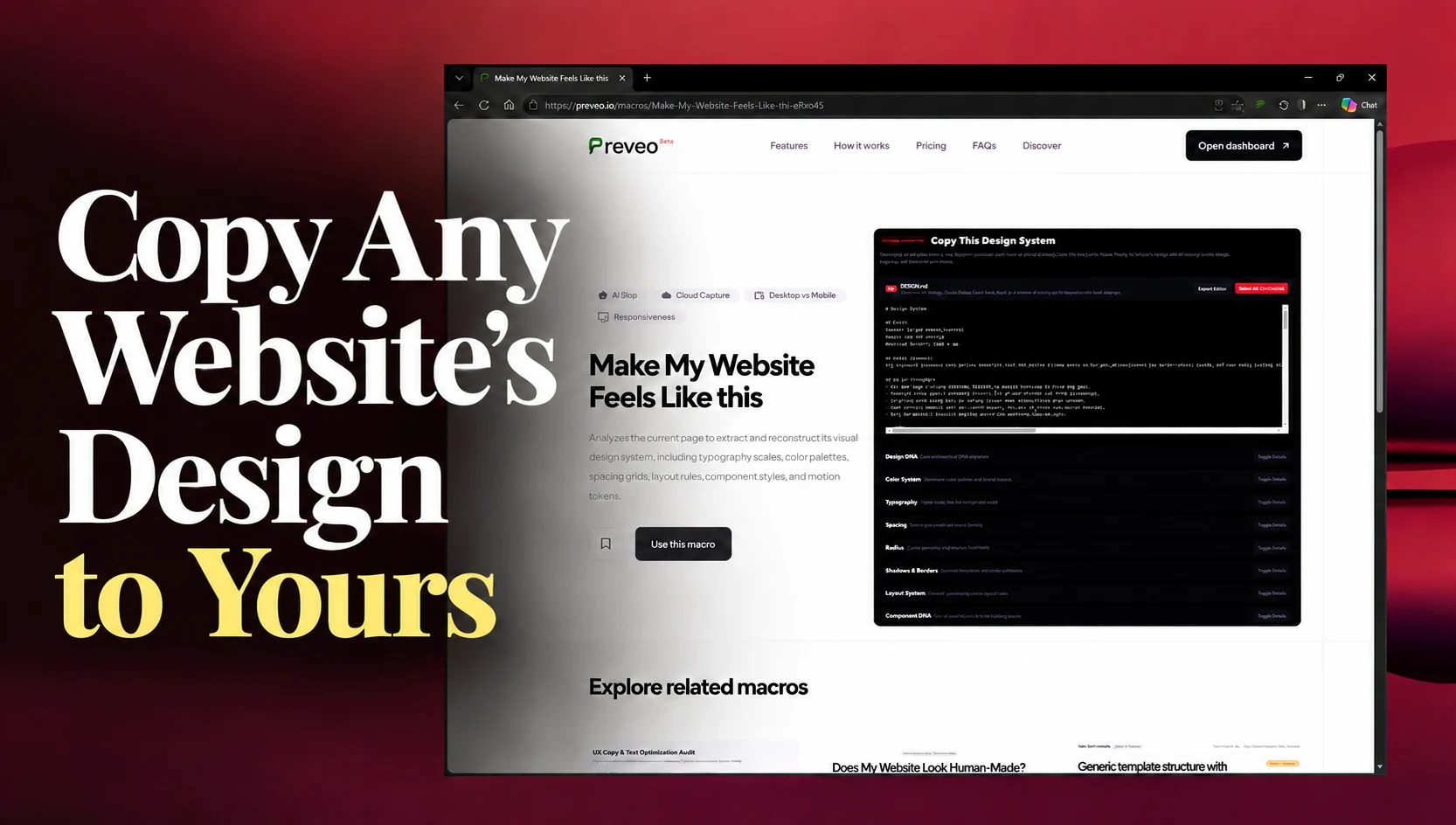
Your AI builder has produced a working website. But visually, it feels like the same website everyone else is generating.
You ask for something more distinctive. The gradient changes, the cards get larger, and the overall style stays familiar.
If you use Lovable, Claude, Codex, Replit, or Cursor, you may recognize the cycle: generate, review, ask for more personality, repeat.
You know which websites you like. The difficult part is explaining what makes them work—and turning that preference into instructions your builder can apply.
A useful way forward is to give the builder a concrete visual reference, extract the decisions behind it, and keep those decisions in a DESIGN.md.
Here’s how to do that with Preveo.
“Unique” describes the outcome, but leaves the decisions open
Consider this prompt:
Build a modern, unique landing page for my product. Make it clean, premium, and engaging.
It communicates an ambition. It leaves plenty of room for interpretation.
Should the page use oversized editorial typography or compact product-focused headings? Should sections feel spacious or dense? Should the main visual be a screenshot, an illustration, or the typography itself?
The builder still needs to make all those decisions.
When you review the result and ask for “more personality,” you may get changes to individual details without changing the underlying composition.
A different gradient cannot do much for a page whose layout, hierarchy, and components still feel interchangeable.
Start by identifying what you actually like
Choose a reference website that fits the kind of page you are building.
Then describe the qualities you want to bring into your project:
- The headings create a strong contrast with the body text.
- The layout gives product screenshots room to breathe.
- The accent color draws attention to a few important actions.
- The sections vary in composition while sharing consistent spacing.
- The cards use restrained borders and minimal decoration.
These observations give “I like this website” a practical meaning.
You can also be selective. You might want a reference’s typography and spacing while keeping your own colors, navigation, and component structure.
Use your own branding, content, and assets. The reference helps define a direction; your product determines how that direction should be applied.
1. Extract the reference’s design guidance
Preveo’s design-system extraction macro helps turn a reference page into written guidance.
To use it:
- Open the Preveo design-system macro.
- Click Use this Macro.
- Visit your reference website.
- Open the Preveo extension and click Run.
- Review the extracted design guidance.
Look for the decisions that give the page its character:
| Design area | What to look for |
|---|---|
| Typography | Heading scale, body text, weight, and line height |
| Colors | Background, text, accent, and border roles |
| Spacing | Section padding, component gaps, and content density |
| Layout | Content widths, alignment, and arrangement |
| Components | Button, card, and navigation styles |
The relationships matter. A large heading works partly because of the text, spacing, and content around it.
2. Turn the output into a useful DESIGN.md
Review the extraction before handing it to your builder.
Does it capture the qualities you chose the reference for? Are the instructions specific enough to implement? Are there details that would feel out of place in your product?
Save the reviewed guidance as DESIGN.md in your project.
A DESIGN.md is a Markdown document containing design instructions. It has no universal schema, and you should explicitly tell your builder to read it.
Useful guidance connects a rule to its purpose. For example:
## Visual direction
Use a spacious, typography-led layout that keeps attention
on the product and its main action.

## Typography
Create a clear distinction between page titles, section
headings, body text, and labels.

## Color
Reserve the primary accent for the main action and selected
high-priority details.

## Components
Use consistent button heights, border treatments, and
corner radii across repeated components.
This is an illustrative starting point. Replace broad instructions with reviewed values and concrete rules wherever you have them.
A visible reference page also leaves gaps. Add guidance for forms, errors, loading states, and other interactions your product needs.
3. Apply the direction to one representative page
Give your builder a manageable task:
Read DESIGN.md and apply its design guidance to the homepage.

Follow its typography, color roles, spacing, and component rules.
Adapt the layout to our content and responsive requirements.
Use our branding and assets.
Preserve existing functionality.

After implementation, summarize any design decisions that
required interpretation or additional guidance.
Starting with one page lets you review the builder’s interpretation before extending it across the site.
If the typography feels right but the layout feels crowded, you can correct that specific issue while the scope is still small.
4. Review the differences and refine
Compare the implementation with your intended direction.
Check whether the heading hierarchy is clear, the section spacing feels appropriate, and the accent color still carries emphasis. Look at repeated buttons and cards for consistency.
Preveo can help evaluate how closely your implementation follows the reference design. Review its findings and turn the relevant differences into focused tasks.
For example:
Refine the homepage using DESIGN.md:

1. Increase the spacing between major sections.
2. Strengthen the distinction between H1, H2, and body text.
3. Apply one consistent primary button style.

Preserve the existing content and functionality.
These are illustrative corrections, not findings from an actual Preveo run.
Review the result again, including mobile layouts and interactions.
Give your builder something concrete to follow
“Make it unique” leaves the visual decisions open. A reviewed reference and a useful DESIGN.md make those decisions easier to discuss, implement, and check.
You can point to a heading scale, a spacing rule, or a component treatment instead of starting another round of “make it feel more premium.”
Try Preveo’s design-system extraction macro, choose a reference that fits your product, and use it to write a clearer brief for your next build.
 Install Browser Extension